Logos are an essential part of a brand’s identity. A great logo encapsulates the personality and promise of the business behind it.
Some of the world’s most ubiquitous logos had humble beginnings. In 1975, Carolyn Davidson was paid $35 to develop the Nike logo and the “Swoosh” we’ve come to recognize has remained more or less intact for nearly forty years.
Pepsi paid the Arnell Group $1 million to develop its updated logo in 2008. There are companies who’ve paid tens of millions for logo design.
Apple
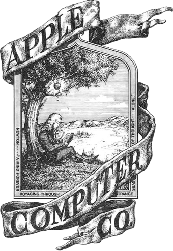
The first Apple logo, unveiled in 1976,
That’s Isaac Newton sitting under an apple tree, in case you’re wondering. It was designed back in 1976 and featured a phrase around the border which read “Newton…A mind forever voyaging through strange seas of thought…alone”. That complicated premise was designed by Ronald Wayne, a founder of Apple, who relinquished his 10 percent stock in the company as an $800 payment for his logo. He left the company two weeks into his tenure.
The first Apple logo, drawn by Ronald Wayne, depicts Isaac Newton under an apple tree. Created by Rob Janoff in 1977,when he was approached by Regis McKenna to be his art director, and was tasked to design the logo for Apple Computer. the Apple logo with the rainbow scheme was used from April of that year until August 26, 1999.
Canon
in 1934, two Japanese inventors created a camera under the banner of the Precision Optical Instruments Laboratory. The camera was called the Kwanon, named after the Buddhist Bodhisattva of Mercy.

The logo included Kwanon encircled by flames and sporting a thousand arms. Canon didn’t just change their logo, they also changed the name of their company as well.the new logo and name has become iconic and memorable.
IBM
The first logo appeared in 1889, when the company was called International Time Recording Co. In 1924, the company changed its name International Business Machines, or IBM.

The IBM logo is easily recognized by the distinctive eight stripes that make up the letters IBM. The horizontal stripes are intended to suggest “speed and dynamism.”
IBM was a company known for its employee time-keeping systems, weight scales, meat slicers and punched-card tabulators.
The second logo of IBM was created in 1972, and hasn’t been altered since then.
Firefox

the phoenix that we see on the left was the very first logo, which debuted in 2002. Since then, it has gone through a number of different incarnations to. The phoenix logo never really connected with users, as it was never regarded as being as smooth or as slick as the more modern version.
Netscape Navigator may be largely forgotten today, its inventions like JavaScript and the Gecko web engine power the vast majority of websites online. Phoenix it is!
Mazda

It’s surprising that some of the original logos of companies hardly showed any creativity. Take the original company logo for Mazda — it just tells you the name of the company. This rather simple logo emerged back in 1934, but since then it has gone through various changes. Mazda started to test out the M iconography in 1936, which evolved into the version are all familiar with by 1997.
Ahura Mazda, according to the Ancient History Encyclopedia, “is the creator of the universe and all the things in it, being at the same time wise and good”.
In 1991, Mazda adopted a corporate symbol which was to represent a sun and a flame standing for heartfelt passion. This is commonly referred to in Mazda enthusiast circles as the “cylon” logo. Shortly after the release of the new symbol, the design was smoothed out to reduce its similarity to Renault’s.
McDonald’s
You might think that you knew everything that there is to know about the McDonalds’s brand. After all, it has one of the most famous of all logos of companies. That large, yellow M stands out from all others, and people instantly recognize it when they see it. However, it hasn’t always been like that.
Founders (and brothers) Richard and Maurice McDonald came up with the golden arches concept, sketching the original version on paper while interviewing architects. Three architects told them the arches were a bad idea. The fourth was willing to make them work.
This logo is the first one for the company, and you will notice that it mentions a barbecue. That’s because between 1940 and 1948, McDonald’s believed that the future was in a barbecue. It was not until later that they decided to switch to focus on hamburgers, after a bit of influence from Ray Kroc, and the rest is history.
On May 4, 1961, McDonald’s first filed for a U.S. trademark on the name “McDonald’s” with the description “Drive-In Restaurant Services”, which continues to be renewed. By September 13, McDonald’s, under the guidance of Ray Kroc, filed for a trademark on a new logo—an overlapping, double-arched “M” symbol.
Kodak
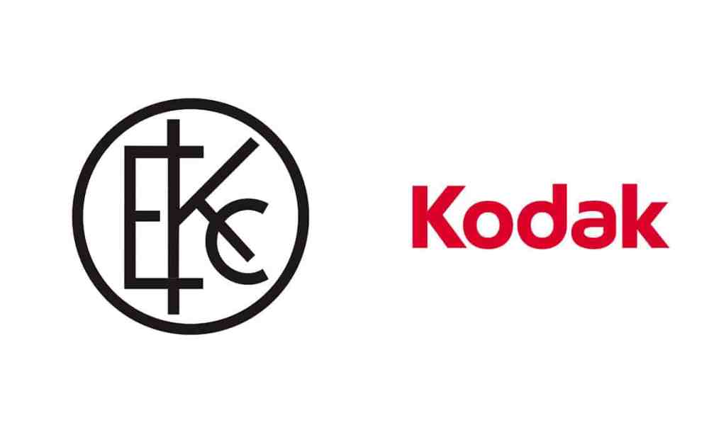
The version on the left was the very first one that they produced in 1907 and it was at a time when they had focused exclusively on print advertising. Since then, they have evolved and developed their business, and their logo has changed as a result. The version on the right is the current model that first appeared in 2006. It has a simple look with a simple font, but it still gets the point across.
The Kodak ‘K’ logo was introduced in 1971. The version seen here – with the ‘Kodak‘ name in a more modern typeface – was used from 1987 until the logo’s discontinuation in 2006. A revised version was reintroduced in 2016.
Lego
LEGO has been entertaining children for decades, and their logo has certainly changed a number of times since its launch. In fact, it has had 26 alterations made to it, which is pretty impressive for such an iconic brand.
The logo that you see was the very first one, and it appeared back in 1935.
This one, which is the current version, has been used since 1998 and appears to be the one that the company has settled on.
Microsoft
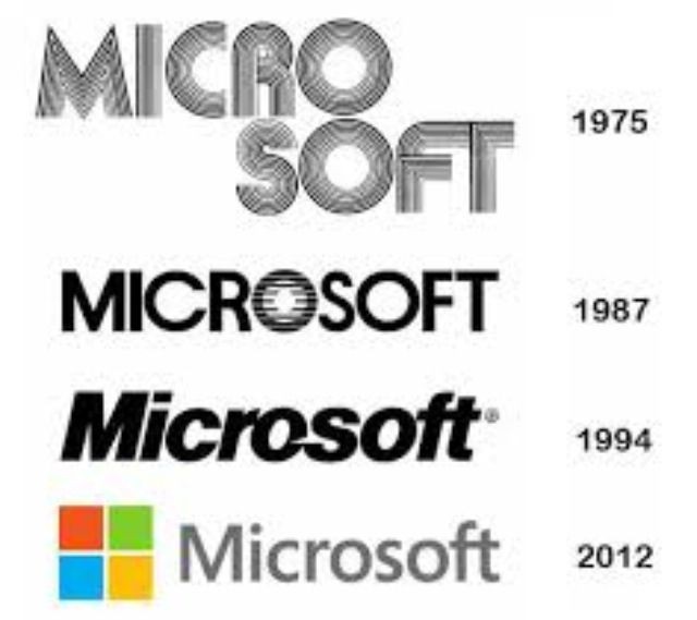
Microsoft’s logo at least looked like it belonged to the 20th century.
that the company name was a union of microcomputer and software. The earliest version of the business name was Micro-Soft.
Motorola
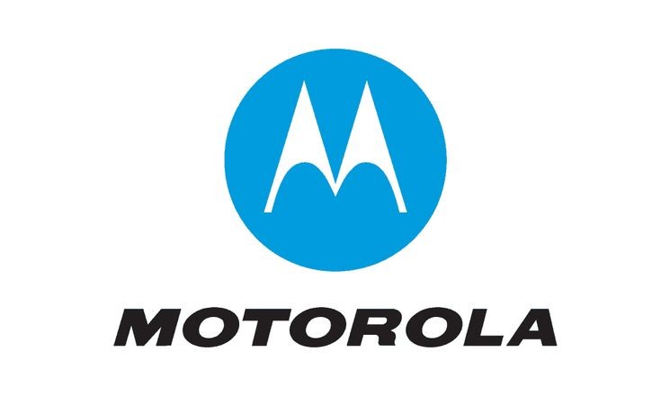
In 1930, the Chicago-based Galvin Manufacturing Corporation released the wildly popular Motorola car radio. The name was a mashup of “motor” and “ola,” a popular suffix for sound gear of the time, along the lines of the Victrola.
The new car radio was such a hit that founder Paul Galvin decided to change the company name to Motorola. The company’s product line clearly evolved through the years as well.
Nokia

Knut Fredrik Idestam founded a wood-pulp mill in Finland and took the name of a nearby town. Nokia is also the Finnish word for a dark, furry weasel-like animal. The modern company was born when, in 1967, a merger occurred between Finnish Rubber Works, the Nokia Wood Mill and the Finnish Cable Works.
Xerox
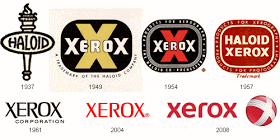
Xerox began in 1906 as the Haloid Company, a manufacturer of photographic paper and equipment. Twenty years later, Chester Carlson, an inventor of a process known as electrophotography, approached the company to see if they would invest in his new technology.
In 1959, the world’s first photocopier was released to the market—the Haloid Xerox 914. The copier was so successful that the company dropped Haloid from its name and never looked back. Well, at least not until the digital age of photography dawned, requiring a complete company overhaul… and of course, a new logo.
